

AI Integration Quick Reference
AI Integration Quick Reference
Where It Fits
CometChatUsers is a list component. It renders all available users and emits the selected User via setOnItemClick. Wire it to CometChatMessageHeader, CometChatMessageList, and CometChatMessageComposer to build a direct messaging layout.
- Kotlin
- Java
ChatActivity.kt
Quick Start
Add the component to your layout XML:layout_activity.xml
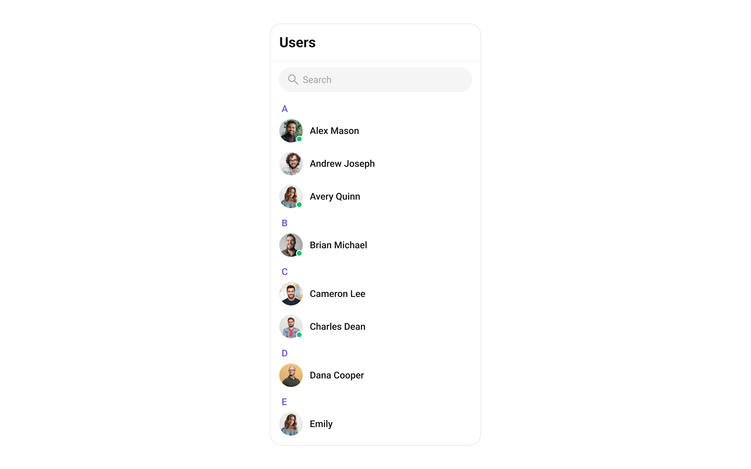
CometChatUIKit.init(), a user logged in, and the cometchat-chat-uikit-android dependency added.
To add programmatically in an Activity:
- Kotlin
- Java
YourActivity.kt
- Kotlin
- Java
YourFragment.kt
Filtering Users
Pass aUsersRequest.UsersRequestBuilder to setUsersRequestBuilder. Pass the builder instance — not the result of .build().
- Kotlin
- Java
Filter Recipes
The component uses infinite scroll — the next page loads as the user scrolls to the bottom. Refer to UsersRequestBuilder for the full builder API.
Search Request Builder
UsesetSearchRequestBuilder to customize the search list separately from the main list:
- Kotlin
- Java
Actions and Events
Callback Methods
setOnItemClick
Fires when a user row is tapped. Primary navigation hook — set the active user and render the message view.
- Kotlin
- Java
YourActivity.kt
What this does: Replaces the default item-click behavior. When a user taps a user item, your custom lambda executes instead of the built-in navigation.
setOnItemLongClick
Fires when a user row is long-pressed. Use for additional actions like block or mute.
- Kotlin
- Java
YourActivity.kt
setOnBackPressListener
Fires when the user presses the back button in the app bar. Default: navigates to the previous activity.
- Kotlin
- Java
YourActivity.kt
setOnSelect
Fires when a user is checked/unchecked in multi-select mode. Requires setSelectionMode to be set.
- Kotlin
- Java
YourActivity.kt
setOnError
Fires on internal errors (network failure, auth issue, SDK exception).
- Kotlin
- Java
YourActivity.kt
setOnLoad
Fires when the list is successfully fetched and loaded.
- Kotlin
- Java
YourActivity.kt
setOnEmpty
Fires when the list is empty, enabling custom handling such as showing a placeholder.
- Kotlin
- Java
YourActivity.kt
- Verify: After setting an action callback, trigger the corresponding user interaction (tap, long-press, back, select) and confirm your custom logic executes instead of the default behavior.
Global UI Events
CometChatUserEvents emits events subscribable from anywhere in the application. Add a listener and remove it when no longer needed.
- Kotlin
- Java
Add Listener
SDK Events (Real-Time, Automatic)
The component listens to these SDK events internally. No manual attachment needed unless additional side effects are required.Automatic: user presence changes update the status indicator in real time.
Functionality
Small functional customizations such as toggling visibility of UI elements and configuring selection modes.- Verify: After calling a visibility method, confirm the corresponding UI element is shown or hidden.
Custom View Slots
Each slot replaces a section of the default UI. Slots that accept aUser parameter receive the user object for that row via the UsersViewHolderListener pattern (createView + bindView).
setLeadingView
Replace the avatar / left section.
- Kotlin
- Java
What this does: Registers aUsersViewHolderListenerthat provides a custom view for the leading (left) area of each user item.createViewinflates your layout, andbindViewpopulates it with user data.
setTitleView
Replace the name / title text.
- Kotlin
- Java
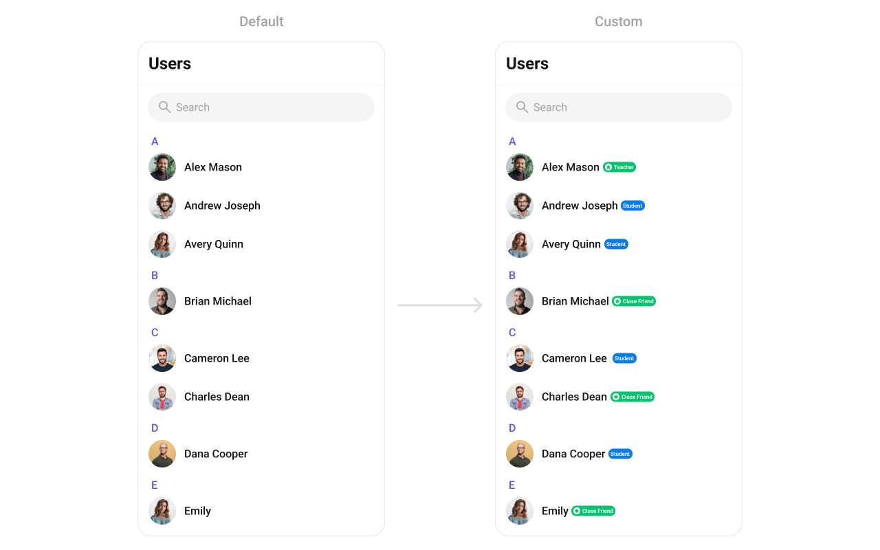
custom_user_title_view.xml layout:
custom_user_title_view.xml
- Kotlin
- Java
setSubtitleView
Replace the subtitle text below the user’s name.
- Kotlin
- Java
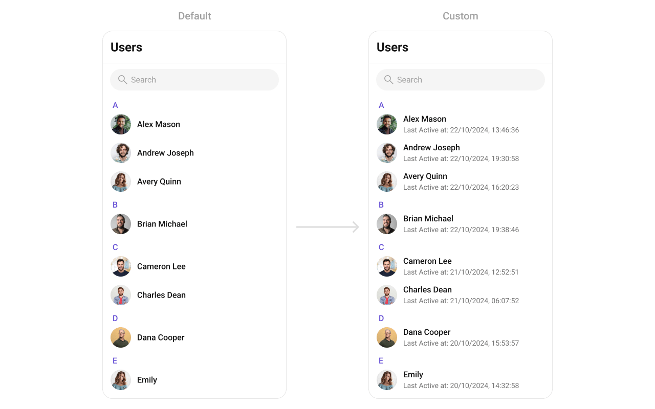
- Kotlin
- Java
setTrailingView
Replace the right section of each user item.
- Kotlin
- Java
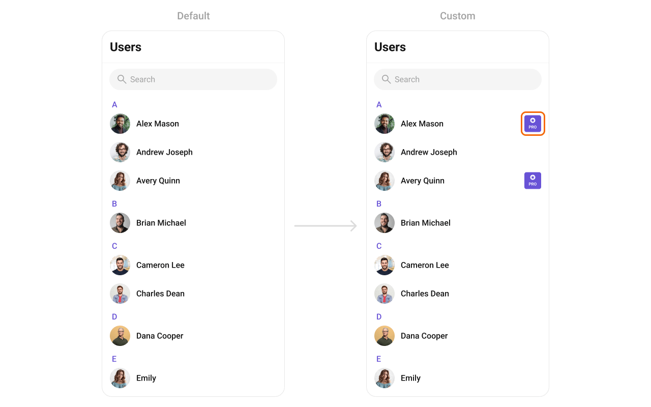
custom_user_tail_view.xml layout:
custom_user_tail_view.xml
- Kotlin
- Java
setItemView
Replace the entire list item row.
The Java method name is
seItemView (note the missing ‘t’). This is a known typo in the SDK. In Kotlin, property access syntax normalizes this.- Kotlin
- Java
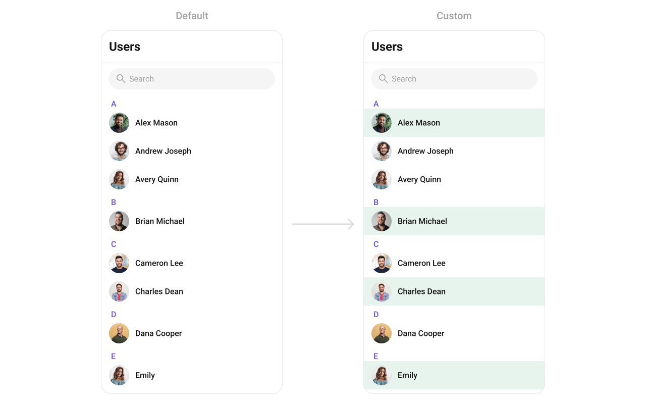
custom_list_item_view.xml layout:
custom_list_item_view.xml
- Kotlin
- Java
setOptions
Replace the long-press context menu entirely.
- Kotlin
- Java
addOptions
Append to the long-press context menu without removing defaults.
- Kotlin
- Java
setLoadingView
Sets a custom loading view displayed when data is being fetched.
- Kotlin
- Java
setEmptyView
Configures a custom view displayed when there are no users in the list.
- Kotlin
- Java
setErrorView
Defines a custom error state view that appears when an issue occurs while loading users.
- Kotlin
- Java
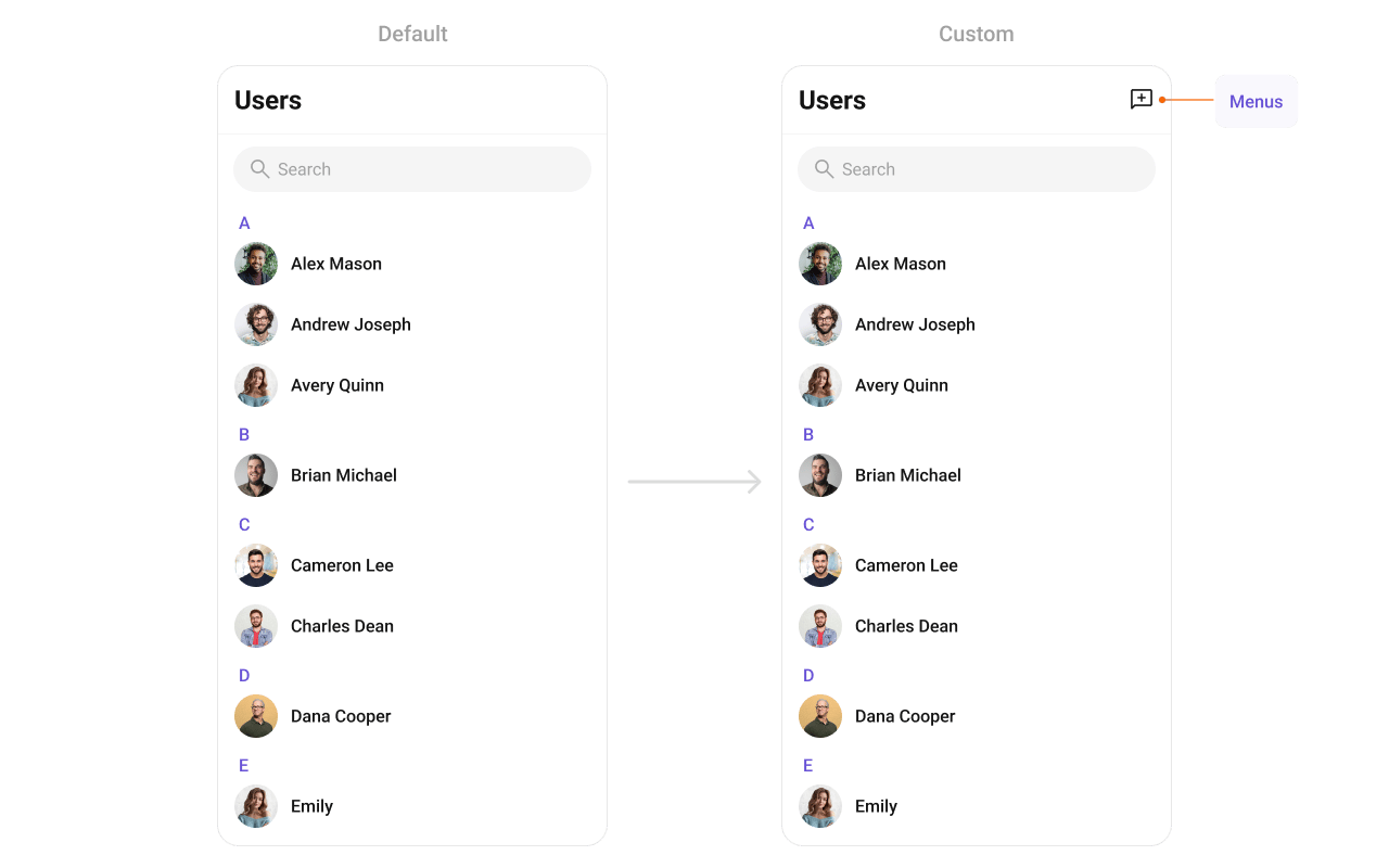
setOverflowMenu
Replace the toolbar overflow menu.
- Kotlin
- Java
- Verify: After setting any custom view slot, confirm the custom view renders in the correct position within the user list item, and the data binding populates correctly for each user.
Common Patterns
Hide all chrome — minimal list
- Kotlin
- Java
Friends-only list
- Kotlin
- Java
Online users only
- Kotlin
- Java
Advanced Methods
Programmatic Selection
selectUser
Programmatically selects or deselects a user. Works with both SINGLE and MULTIPLE selection modes.
- Kotlin
- Java
InSINGLEmode, selecting a new user replaces the previous selection. InMULTIPLEmode, calling this on an already-selected user deselects it (toggle behavior).
clearSelection
Clears all selected users and resets the selection UI.
- Kotlin
- Java
getSelectedUsers
Returns the list of currently selected User objects.
- Kotlin
- Java
Selected Users List
When using multi-select mode, a horizontal list of selected users can be shown above the main list.Search Input Customization
The built-in search box can be customized programmatically:Internal Access
These methods provide direct access to internal components for advanced use cases.Use these only when the standard API is insufficient. Directly manipulating the adapter or ViewModel may conflict with the component’s internal state management.
Style
The component uses XML theme styles. Define a custom style with parentCometChatUsersStyle in themes.xml, then apply with setStyle().
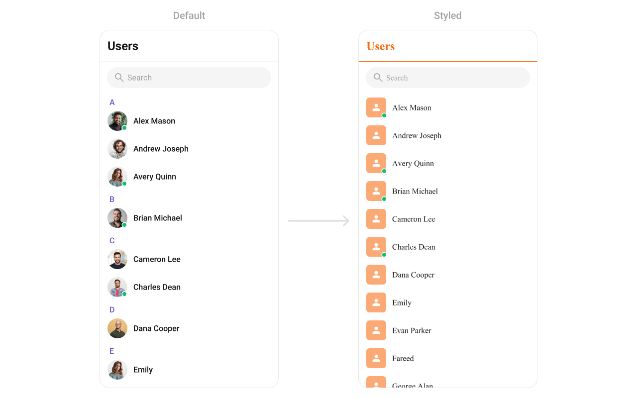
themes.xml
- Kotlin
- Java
Programmatic Style Properties
In addition to XML theme styles, the component exposes programmatic setters for fine-grained control:Checkbox Style Properties (Selection Mode)
When usingSINGLE or MULTIPLE selection mode, checkboxes appear on each item:
Customization Matrix
Next Steps
Conversations
Browse recent conversations
Groups
Browse and search available groups
Message List
Display messages in a conversation
Theming
Customize colors, fonts, and styles