

AI Integration Quick Reference
AI Integration Quick Reference
.cometchat or .cometchat-<component> to match your brand.
Selector Contract
Canonical selector patterns for overriding colors. Global override[data-theme="dark"] at the :root level. When controlling dark mode from the app, place data-theme on the wrapper and scope overrides accordingly.
CSS Variable Reference
This table maps every commonly used token to what it visually controls.CSS Specificity & Precedence Rules:
- Component-level overrides (
.cometchat .cometchat-conversations { --var: val }) take precedence over global overrides (.cometchat { --var: val }) - Dark mode overrides (
[data-theme="dark"]) take precedence over light mode defaults - CSS variable overrides only affect properties the UI Kit theme binds to that variable — they do NOT change layout or spacing
- Always keep the
.cometchatprefix to avoid leaking styles into the host app !importantshould never be needed — if it is, the selector specificity is wrong
Color Palette
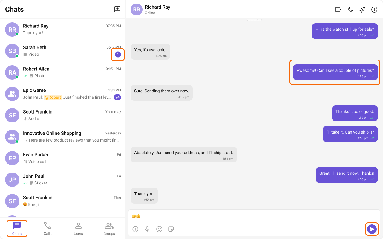
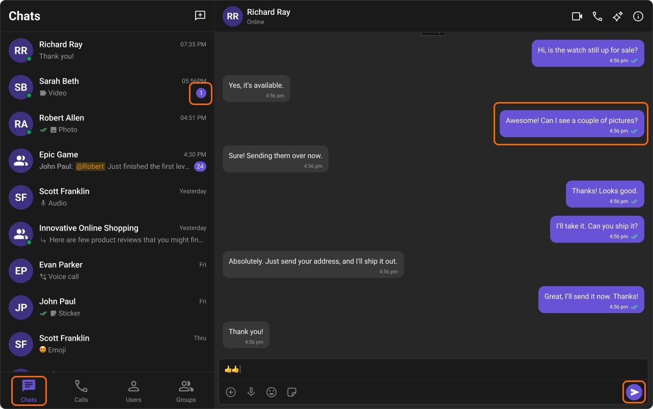
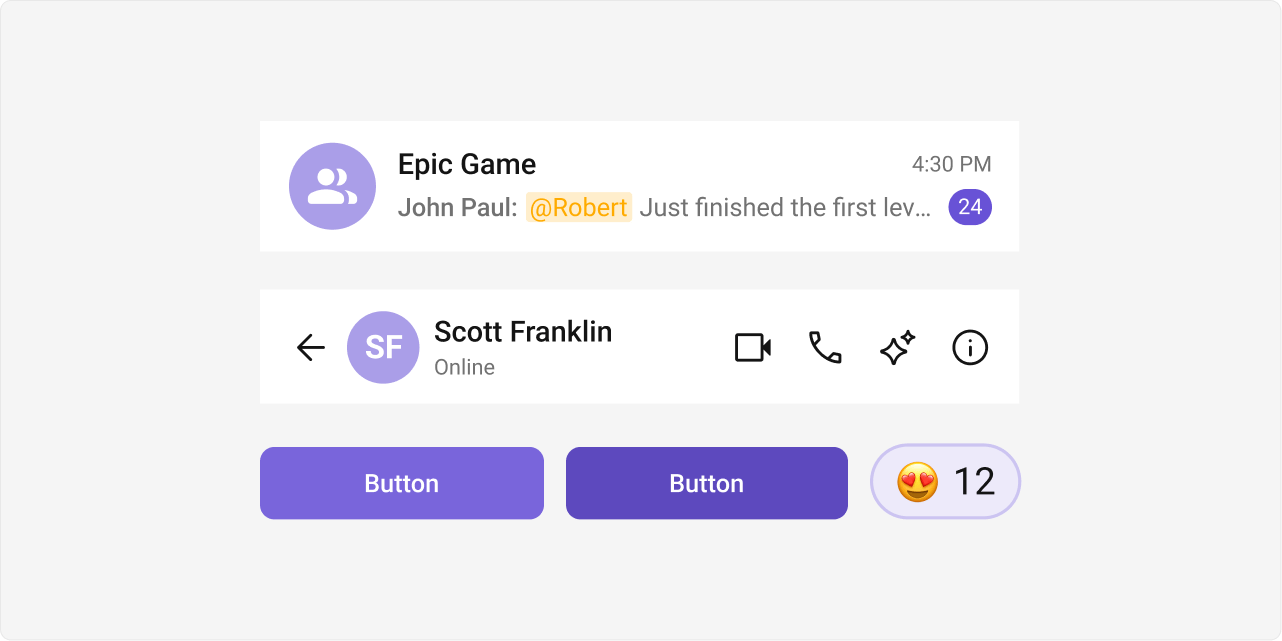
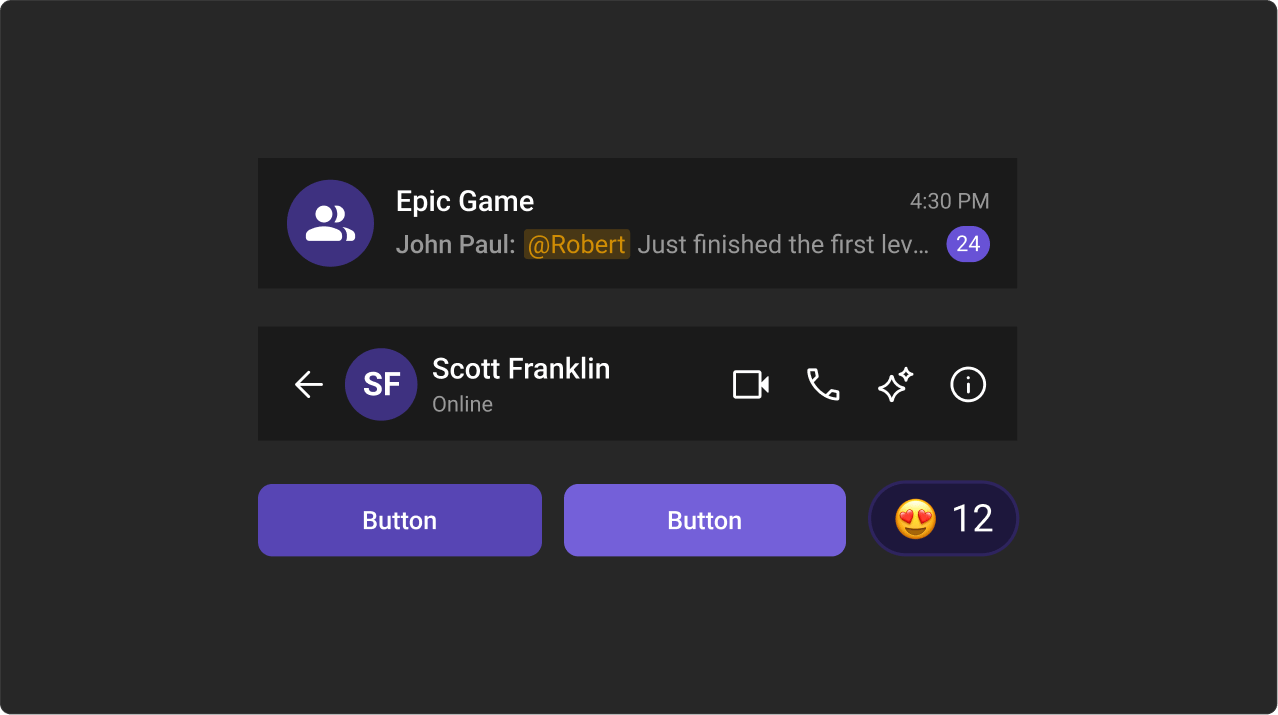
The primary color defines key actions, branding, and UI elements, while the extended primary palette provides variations for supporting components.Primary Color
Light Mode
Dark Mode
Extended Primary Colors
Light Mode
Dark Mode
Complete End-to-End Example: Custom Brand Colors
Step 1: Add toApp.css:
App.tsx imports the CSS: