

AI Agent Component Spec
AI Agent Component Spec
Where It Fits
CometChatUsers is a contact list widget. It renders all available users and emits the selected User via onItemTap. Wire it to CometChatMessages or individual message components (CometChatMessageHeader, CometChatMessageList, CometChatMessageComposer) to build a standard two-panel chat layout.
- Dart
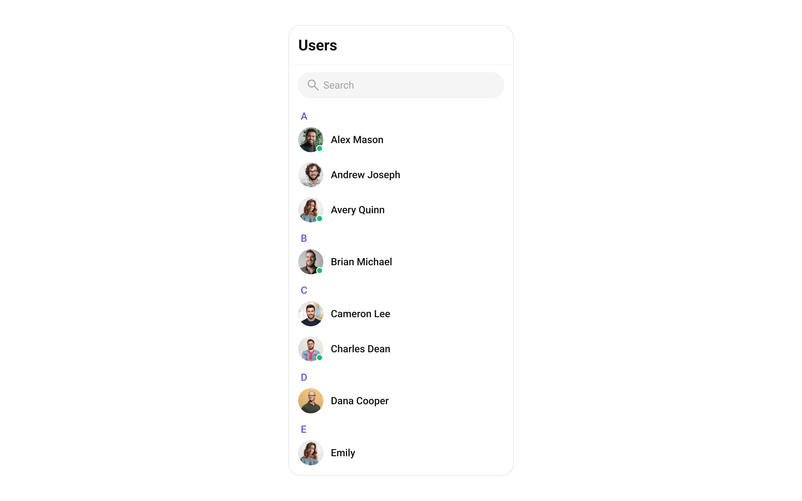
Minimal Render
- Dart
Navigator.push:
Filtering Users
Pass aUsersRequestBuilder to usersRequestBuilder. Pass the builder instance — not the result of .build().
- Dart
Filter Recipes
Default page size is 30. The component uses infinite scroll — the next page loads as the user scrolls to the bottom.
UsersRequestBuilder Properties
Refer to UsersRequestBuilder for the full builder API.
Actions and Events
Callback Props
onItemTap
Fires when a user row is tapped. Primary navigation hook — set the active user and render the message view.- Dart
onItemLongPress
Fires when a user row is long-pressed. Useful for showing context menus or custom actions.- Dart
onSelection
Fires when users are selected in multi-select mode. RequiresselectionMode to be set.
- Dart
onError
Fires on internal errors (network failure, auth issue, SDK exception).- Dart
onBack
Fires when the back button is pressed.- Dart
onLoad
Fires when the user list is successfully loaded.- Dart
onEmpty
Fires when the user list is empty.- Dart
Global UI Events
CometChatUserEvents emits events subscribable from anywhere in the application. Add a listener in initState and remove it in dispose.
When to use: sync external UI with user state changes. For example, update a blocked users count badge when a user is blocked.
- Dart
SDK Events (Real-Time, Automatic)
The component listens to these SDK events internally. No manual attachment needed unless additional side effects are required.
Automatic: user presence changes (online/offline), blocked/unblocked state, connection recovery.
Custom View Slots
Each slot replaces a section of the default UI. Slots that accept a user parameter receive theUser object for that row.
listItemView
Replace the entire list item row.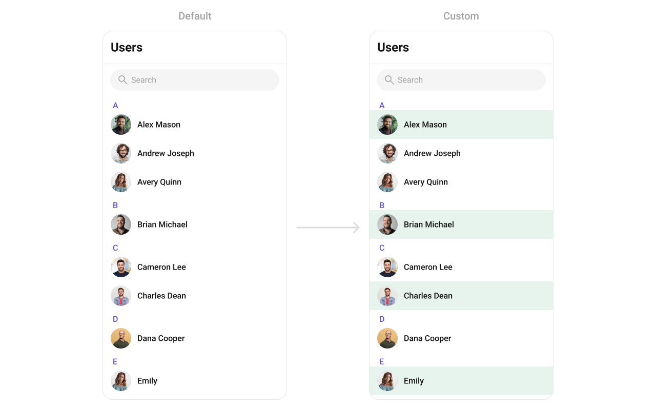
- Dart
leadingView
Replace the avatar / left section.- Dart
titleView
Replace the name / title text. Role badge inline example.- Dart
subtitleView
Replace the subtitle text for each user.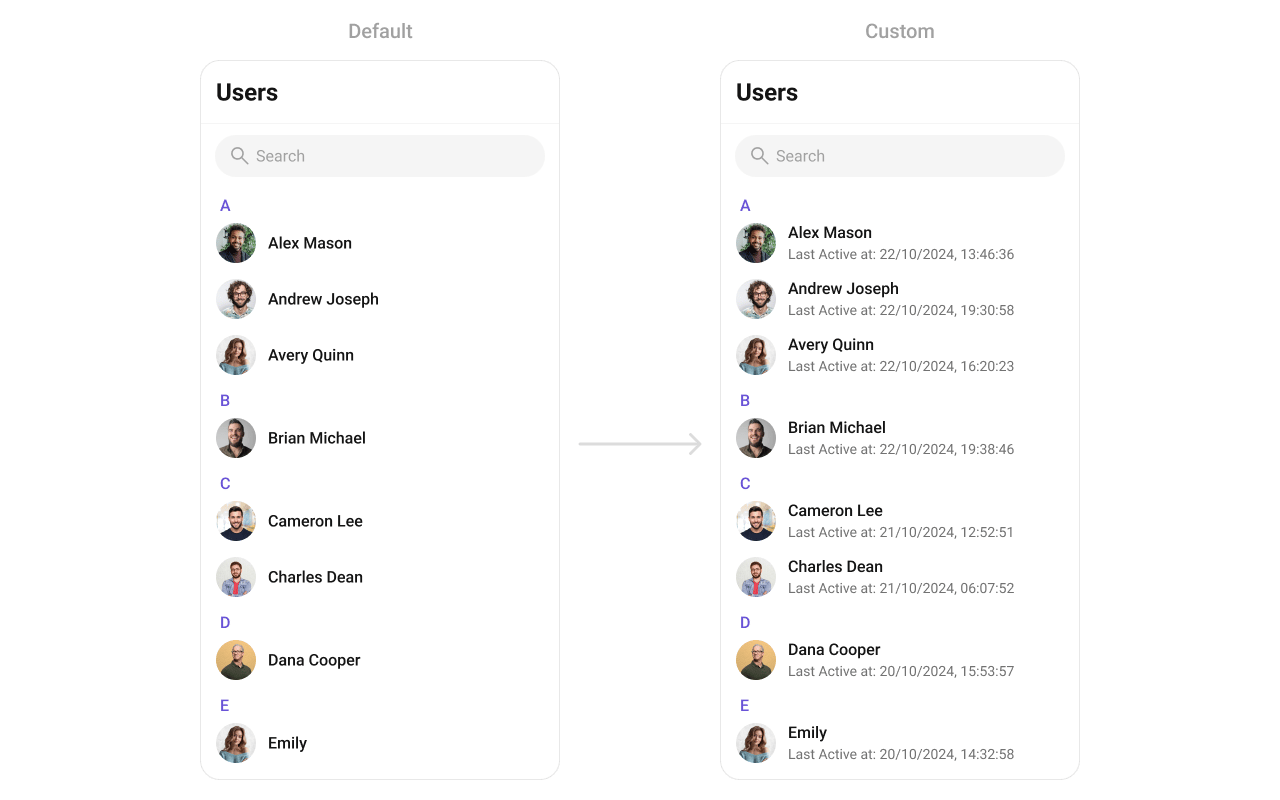
- Dart
trailingView
Replace the right section. Custom tag badge example.- Dart
setOptions
Replace the context menu / long-press actions on each user item.- Dart
addOptions
Add to the existing context menu actions without removing defaults.- Dart
appBarOptions
Add custom widgets to the app bar.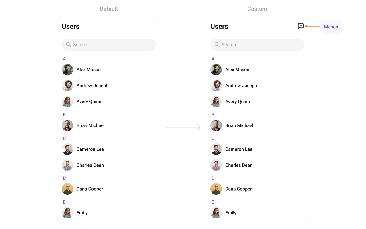
- Dart
- Dart
Styling
SetCometChatUsersStyle to customize the appearance.
- Dart
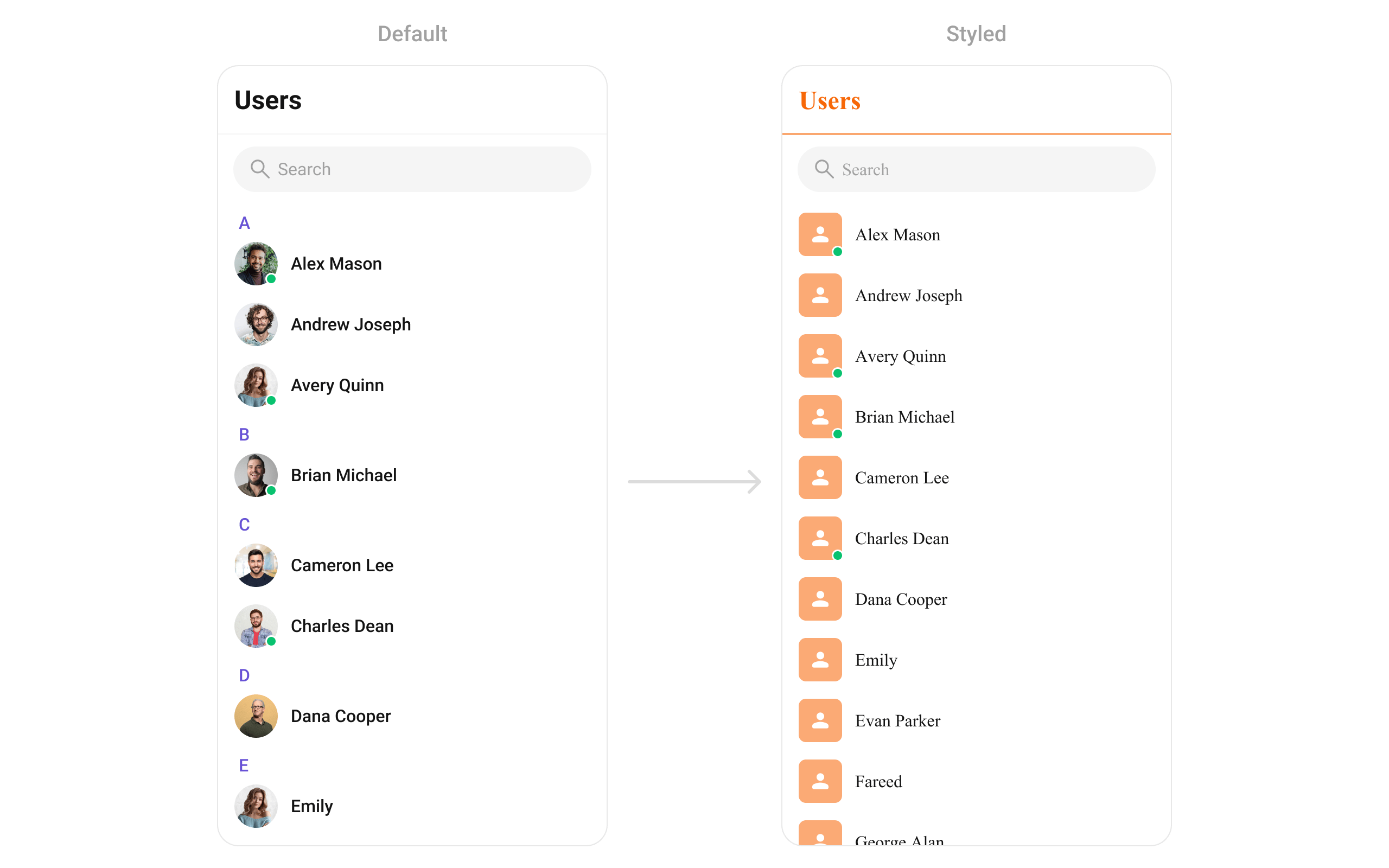
Style Properties
Common Patterns
Custom empty state with CTA
- Dart
Friends-only list
- Dart
Multi-select with selection callback
- Dart
Hide all chrome — minimal list
- Dart
Online users only
- Dart
Accessibility
The component renders a scrollable list of interactive items. Each user row supports:- Tap gesture for selection/navigation
- Long-press gesture for context menu actions
- Checkbox selection in multi-select mode with proper touch targets
- Status indicators with visual feedback for online/offline state
- User names are readable as list item titles
- Status indicators use color coding — consider adding
Semanticswidgets vialeadingViewif screen reader descriptions are needed for these visual indicators - Selection state is communicated through checkbox widgets
Props
All props are optional unless noted.activateSelection
Controls when selection mode activates.
Values:
ActivateSelection.onClick, ActivateSelection.onLongClick
addOptions
Adds additional context menu actions to the default options.appBarOptions
Custom widgets to display in the app bar.backButton
Custom back button widget.controllerTag
Identifier tag for controller management.emptyStateView
Custom view displayed when there are no users.errorStateView
Custom view displayed when an error occurs.height
Height of the widget.hideAppbar
Hides the app bar including title and search.hideSearch
Hides the search input box.leadingView
Custom renderer for the avatar / left section.listItemView
Custom renderer for the entire list item row.loadingStateView
Custom view displayed during loading state.onBack
Callback triggered when the back button is pressed.onEmpty
Callback triggered when the user list is empty.onError
Callback triggered when an error occurs.onItemLongPress
Callback triggered on long press of a user item.onItemTap
Callback triggered when tapping a user item.onLoad
Callback triggered when the list is successfully loaded.onSelection
Callback triggered when users are selected. RequiresselectionMode to be set.
scrollController
Controller for scrolling the list.searchBoxIcon
Custom search box icon widget.searchKeyword
Pre-fills the search and filters the user list.searchPlaceholder
Placeholder text for the search input box.selectionMode
Enables single or multi-select mode.
Values:
SelectionMode.single, SelectionMode.multiple, SelectionMode.none
setOptions
Replaces the default context menu actions.showBackButton
Shows or hides the back button.stickyHeaderVisibility
Hides alphabetical section headers when set totrue.
Note: When
false, alphabetical headers (A, B, C…) are shown to separate users.
submitIcon
Custom submit icon widget for selection mode.subtitleView
Custom renderer for the subtitle text.title
Title text displayed in the app bar.titleView
Custom renderer for the name / title text.trailingView
Custom renderer for the right section.usersProtocol
Custom protocol for fetching users.usersRequestBuilder
Controls which users load and in what order.
Pass the builder instance, not the result of
.build().
usersStatusVisibility
Shows or hides the online/offline status indicator on user avatars.usersStyle
Styling options for the users list.width
Width of the widget.Events
CometChatUsers does not emit custom UI events. It subscribes to:
Customization Matrix
Conversations
Display recent one-on-one and group conversations
Groups
Display and manage group chats
Message List
Display messages in a conversation
Theming
Learn how to customize the look and feel