

Overview
MessageComposer is a Component that enables users to write and send a variety of messages, including text, image, video, and custom messages. Features such as Live Reaction, Attachments, and Message Editing are also supported by it.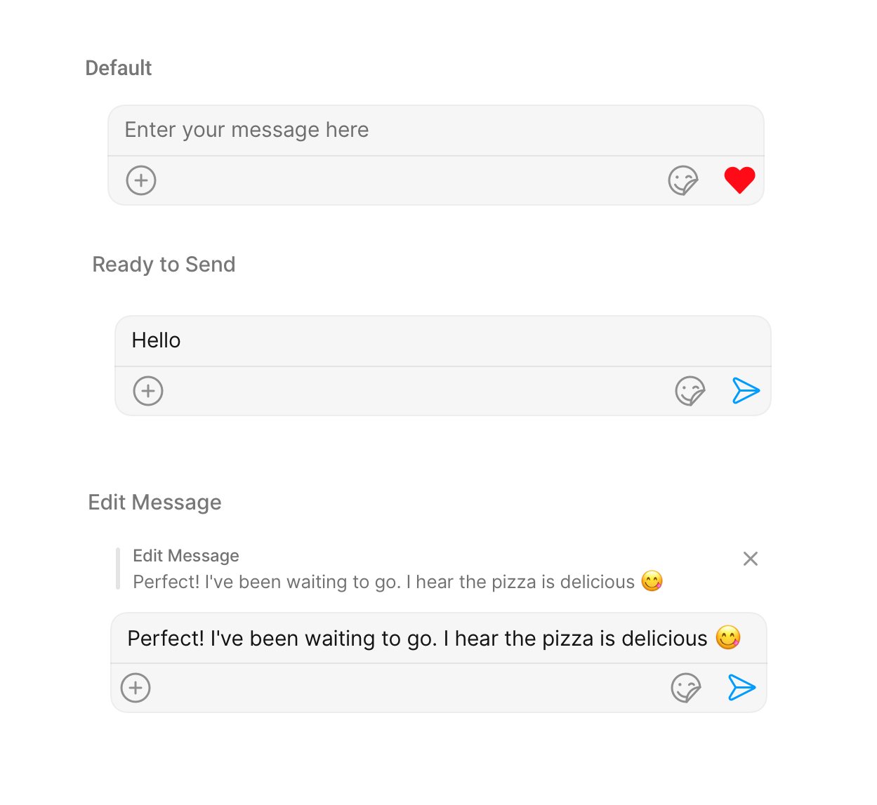
Usage
Integration
The following code snippet illustrates how you can directly incorporate the MessageComposer component into yourlayout.xml file.
Actions
Actions dictate how a component functions. They are divided into two types: Predefined and User-defined. You can override either type, allowing you to tailor the behavior of the component to fit your specific needs.1. OnSendButtonClick
TheOnSendButtonClick event gets activated when the send message button is clicked. It has a predefined function of sending messages entered in the composer EditText. However, you can overide this action with the following code snippet.
- Java
- Kotlin
2. onError
This action doesn’t change the behavior of the component but rather listens for any errors that occur in the MessageList component.- Java
- Kotlin
YourActivity.java
Filters
MessageComposer component does not have any available filters.Events
Events are emitted by aComponent. By using event you can extend existing functionality. Being global events, they can be applied in Multiple Locations and are capable of being Added or Removed.
The MessageComposer Component does not emit any events of its own.
Customization
To fit your app’s design requirements, you can customize the appearance of the MessageComposer component. We provide exposed methods that allow you to modify the experience and behavior according to your specific needs.Style
Using Style you can customize the look and feel of the component in your app, These parameters typically control elements such as the color, size, shape, and fonts used within the component.1. MessageComposer Style
To modify the styling, you can apply the MessageComposerStyle to the MessageComposer Component using thesetStyle method.
- Java
- Kotlin
2. MessageInput Style
To customize the styles of the MessageInput component within the MessageComposer Component, use the.setMessageInputStyle() method. For more details, please refer to MessageInput styles.
- Java
- Kotlin
3. MediaRecorder Style
To customize the styles of the MediaRecorder component within the MessageComposer Component, use the.setMediaRecorderStyle() method. For more details, please refer to MediaRecorder styles.
- Java
- Kotlin
Functionality
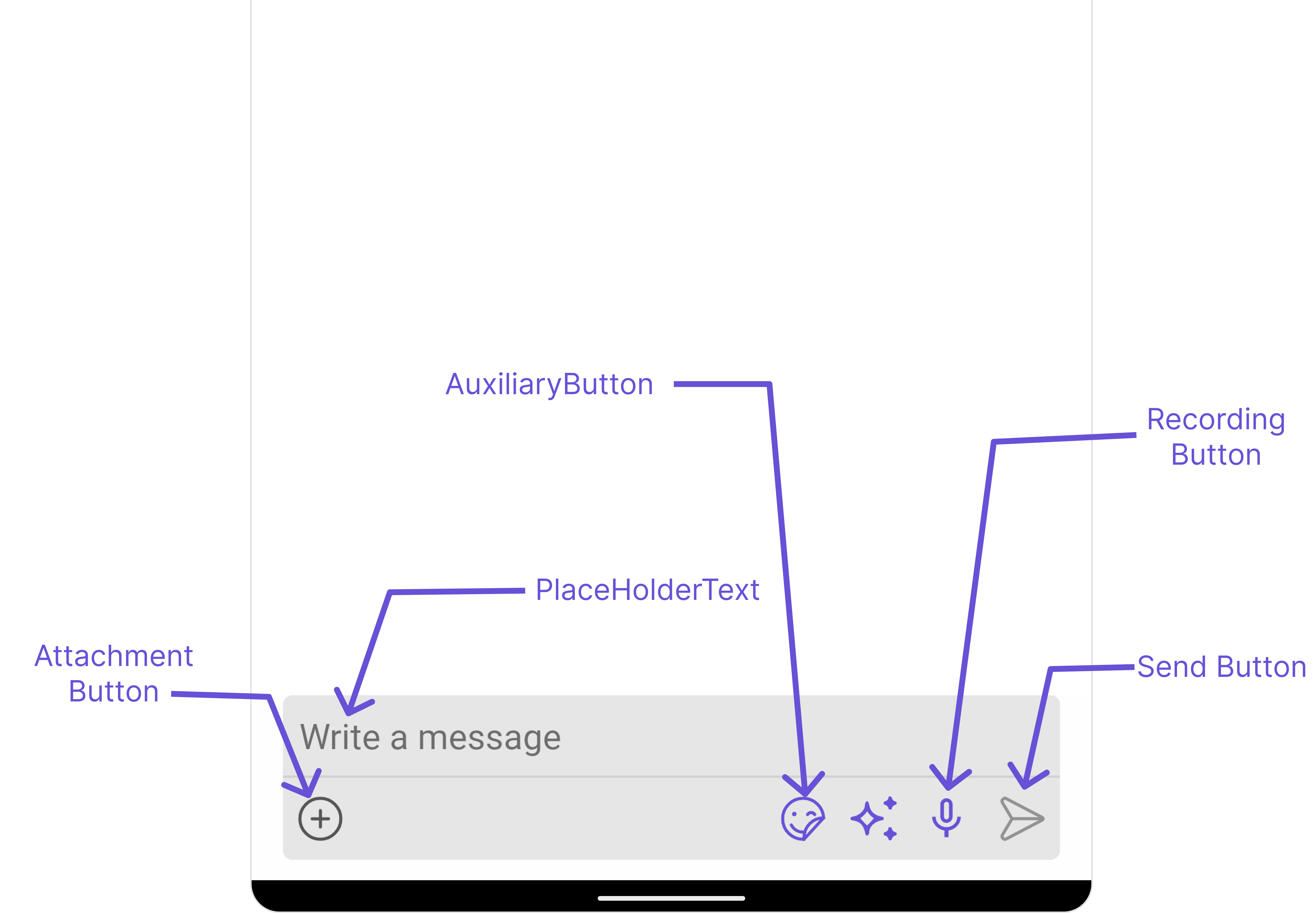
These are a set of small functional customizations that allow you to fine-tune the overall experience of the component. With these, you can change text, set custom icons, and toggle the visibility of UI elements.- Java
- Kotlin
Advanced
For advanced-level customization, you can set custom views to the component. This lets you tailor each aspect of the component to fit your exact needs and application aesthetics. You can create and define your views, layouts, and UI elements and then incorporate those into the component.setTextFormatters
Assigns the list of text formatters. If the provided list is not null, it sets the list. Otherwise, it assigns the default text formatters retrieved from the data source. To configure the existing Mentions look and feel check out CometChatMentionsFormatter Example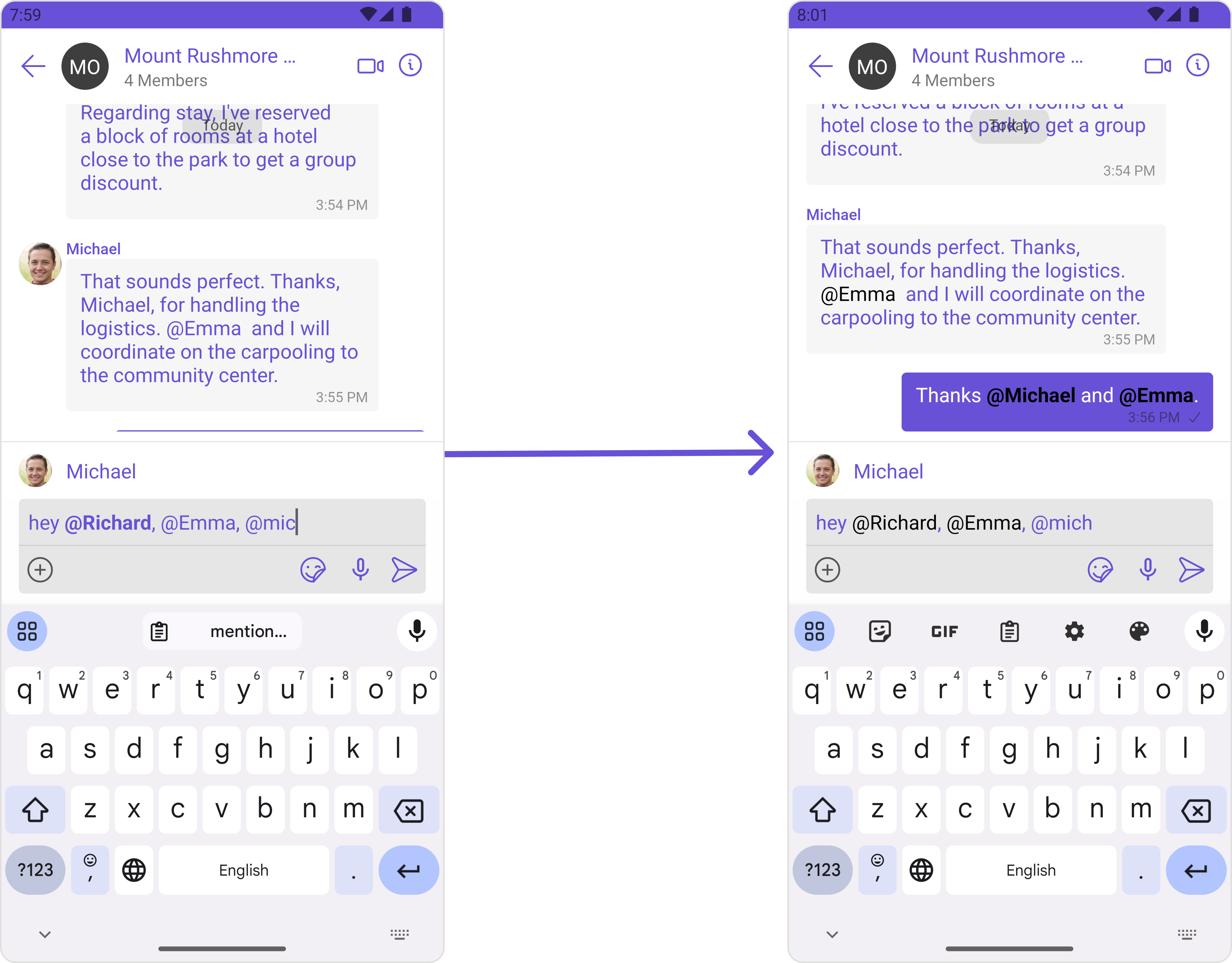
- Java
- Kotlin
AttachmentOptions
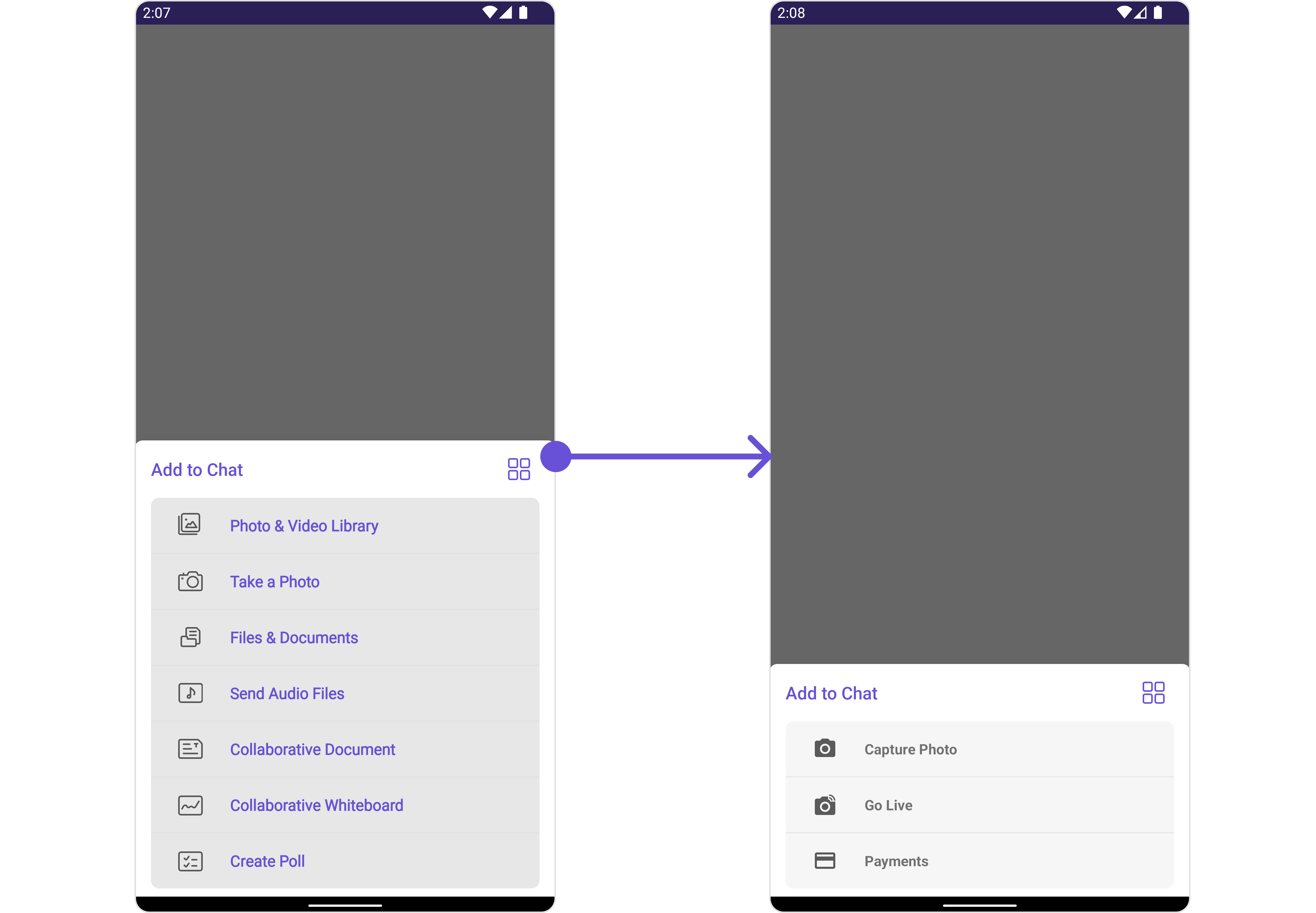
By usingsetAttachmentOptions(), you can set a list of custom MessageComposerActions for the MessageComposer Component. This will override the existing list of MessageComposerActions.
- Java
- Kotlin
- Java
- Kotlin
AuxiliaryButtonView
You can insert a custom view into the MessageComposer component to add additional functionality using the following method.- Java
- Kotlin
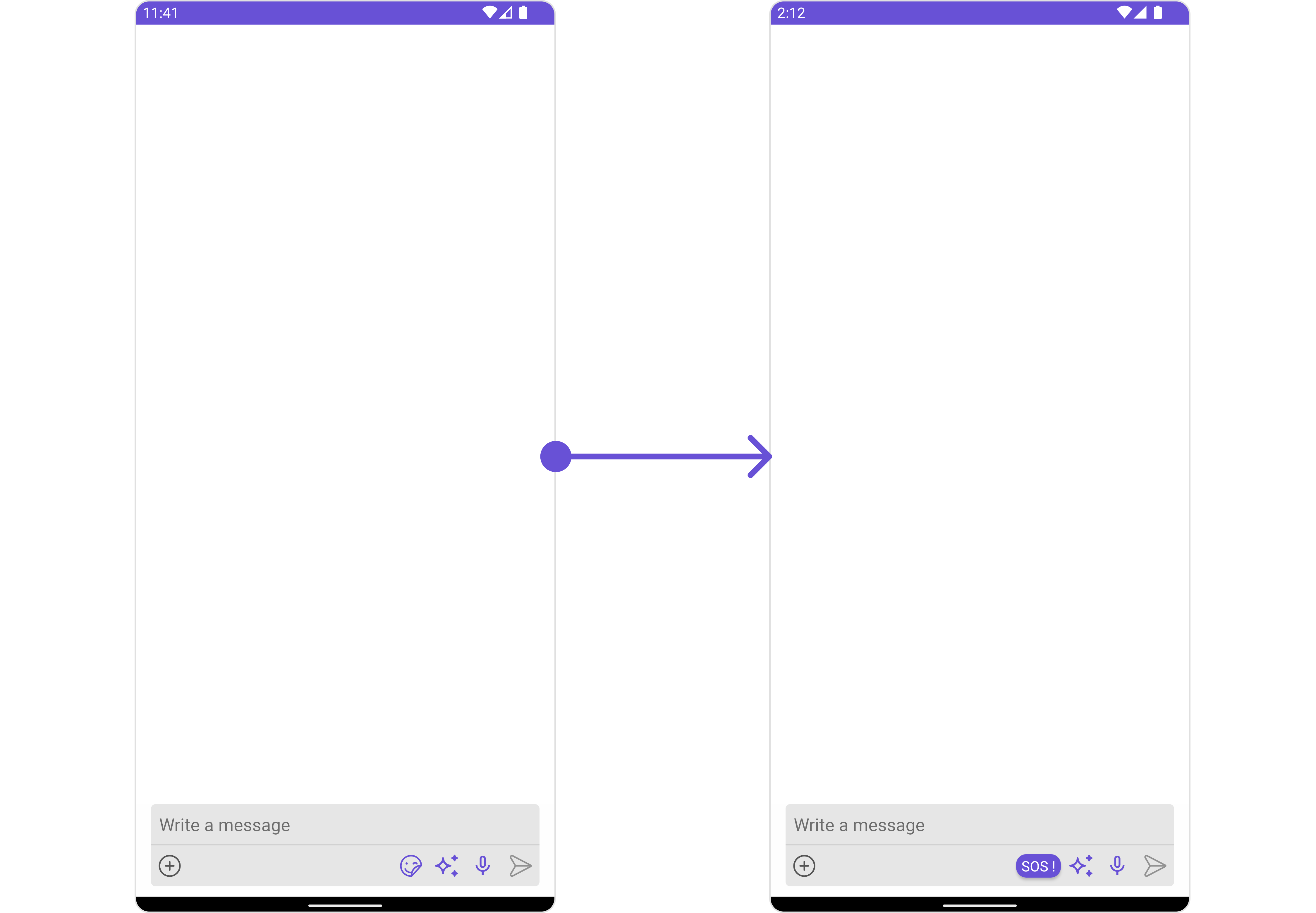
.setAuxiliaryButtonView() function.
auxiliary_button_layout.xml
- Java
- Kotlin
SecondaryButtonView
You can add a custom view into the SecondaryButton component for additional functionality using the below method.- Java
- Kotlin
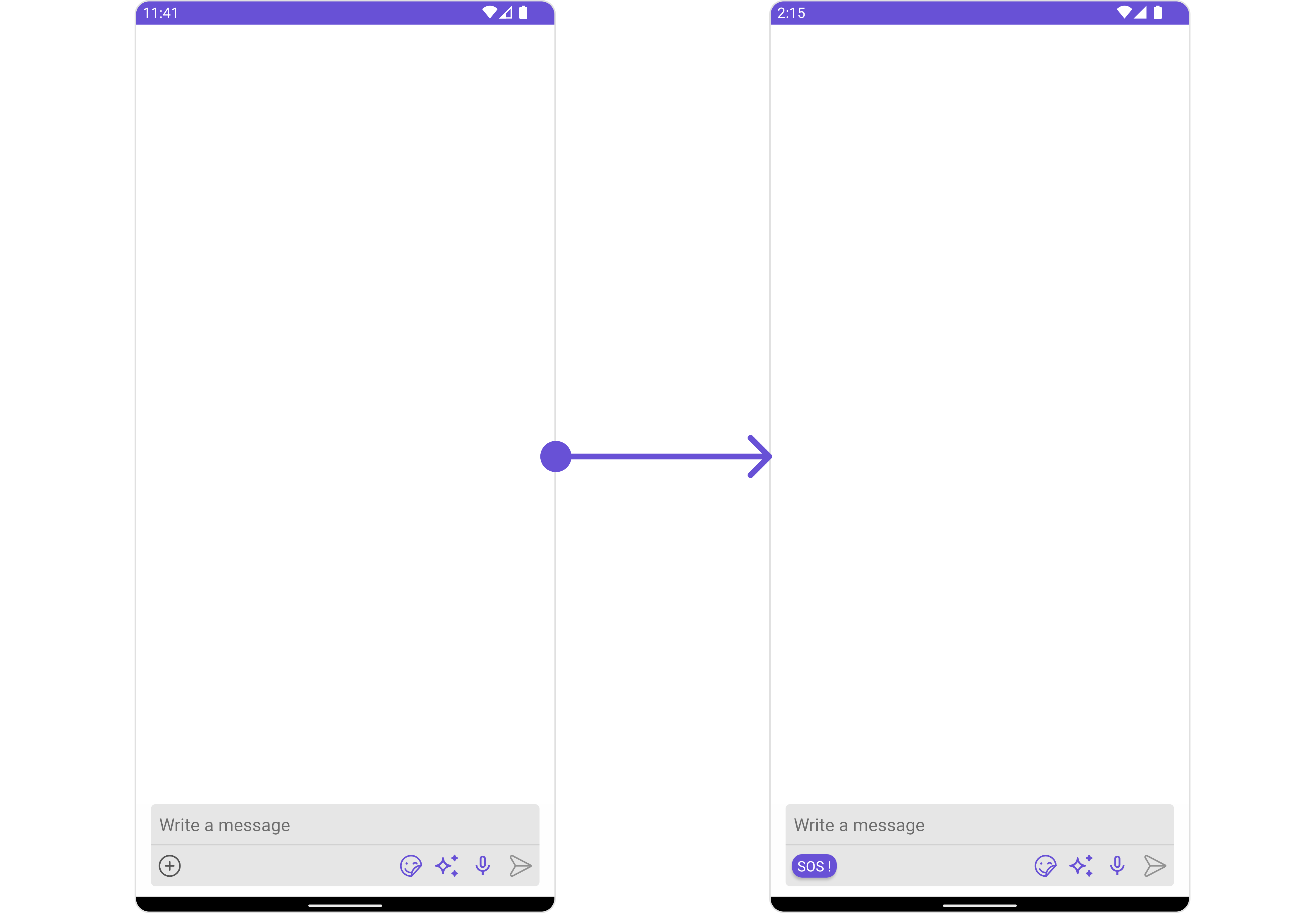
.setSecondaryButtonView() function.
secondary_button_layout.xml
- Java
- Kotlin
Set SendButtonView
You can set a custom view in place of the already existing send button view. Using the following method.- Java
- Kotlin
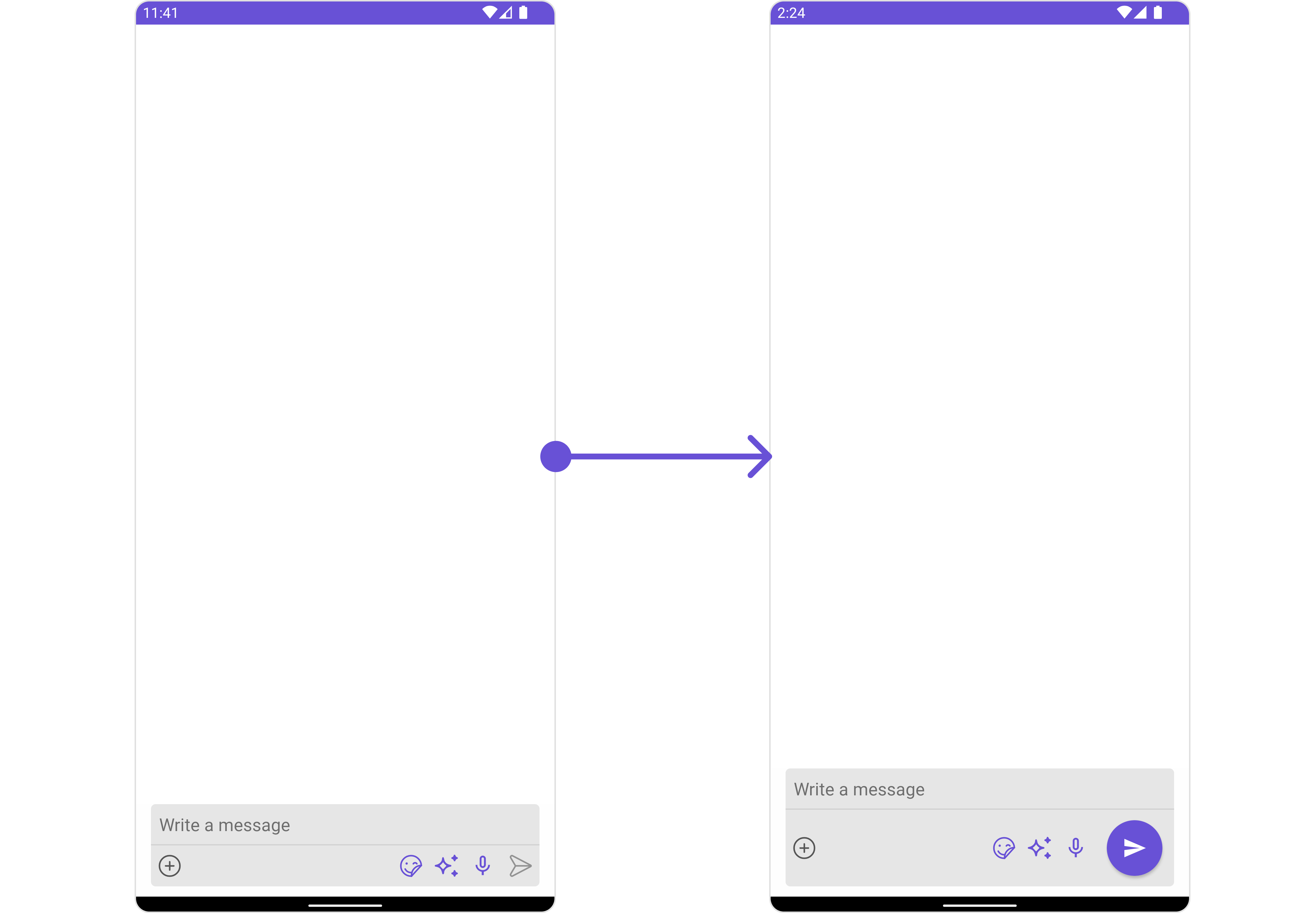
send_button_layout.xml
- Java
- Kotlin
HeaderView
You can set custom headerView to the MessageComposer component using the following method- Java
- Kotlin
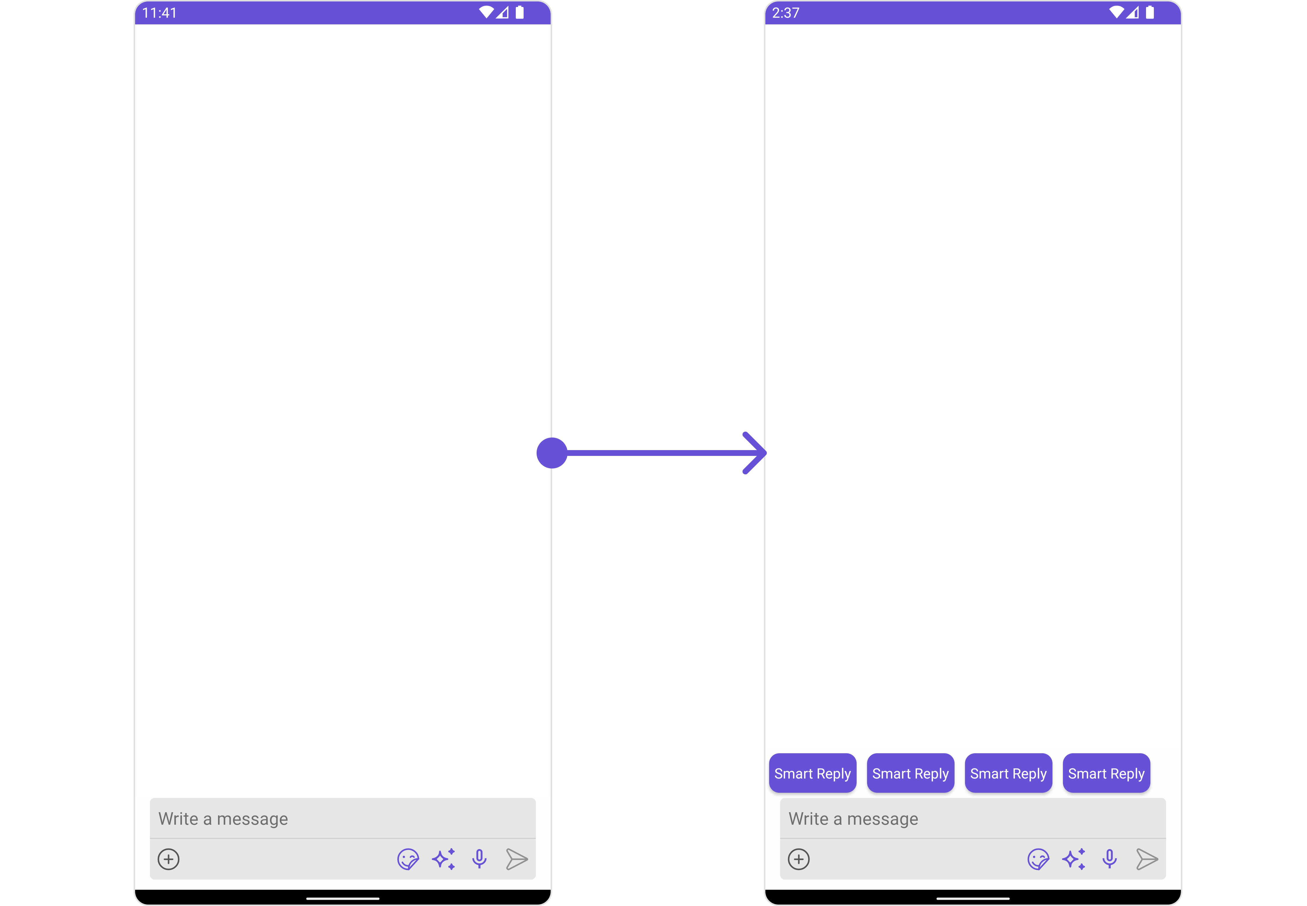
.setHeaderView() method.
custom_header_view_layout
- Java
- Kotlin
FooterView
You can set a custom footer view to the MessageComposer component using the following method:- Java
- Kotlin
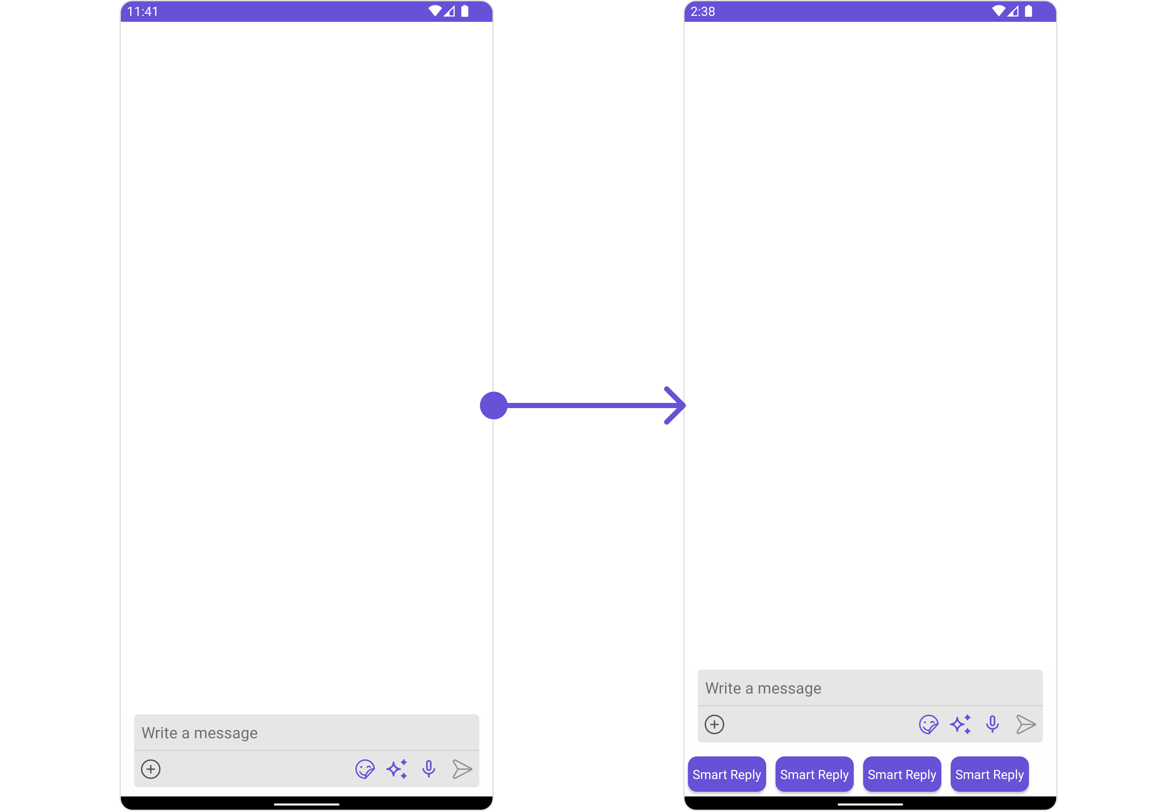
.setFooterView() method.
custom_footer_view_layout
- Java
- Kotlin