

AI Integration Quick Reference
AI Integration Quick Reference
Where It Fits
CometChatMessageComposer provides a rich text input with attachment, emoji, voice recording, sticker, and send controls. Wire it alongside CometChatMessageHeader and CometChatMessageList to build a standard chat view.

Minimal Render
.cometchat-message-composer
Actions and Events
Callback Props
onSendButtonClick
Fires when the send button is clicked. Overrides the default send behavior.onTextChange
Fires as the user types in the composer input.onError
Fires on internal errors.Global UI Events
SDK Events (Real-Time, Automatic)
The component internally handles typing indicators and message sending. No manual SDK listener attachment needed.Custom View Slots
attachmentOptions
Override the default attachment options.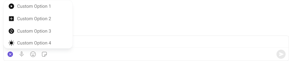
auxiliaryButtonView
Replace the sticker and AI button area.
sendButtonView
Replace the send button.
- TypeScript
- CSS
headerView
Custom view above the composer input.
- TypeScript
- CSS
Common Patterns
Thread composer
Minimal composer — text only
Enter key adds new line
Pre-filled text
CSS Architecture
The component uses CSS custom properties (design tokens) defined in@cometchat/chat-uikit-react/css-variables.css. The cascade:
- Global tokens set on the
.cometchatroot wrapper. - Component CSS (
.cometchat-message-composer) consumes these tokens viavar(). - Overrides target
.cometchat-message-composerdescendant selectors.
Key Selectors
Customization Matrix
Props
All props are optional. Sorted alphabetically.attachmentOptions
Custom attachment options list.auxiliaryButtonView
Custom JSX replacing the sticker and AI button area.customSoundForMessage
URL to a custom audio file for outgoing message notifications.disableMentionAll
Controls whether group mentions like @all appear in suggestions.disableMentions
Disables the mentions functionality.disableSoundForMessage
Disables sound for outgoing messages.disableTypingEvents
Disables the typing indicator for this composer.enterKeyBehavior
Determines Enter key behavior.group
The recipient group for the composer.headerView
Custom component displayed above the composer input.hideAttachmentButton
Hides the entire attachment button.hideAudioAttachmentOption
Hides the audio attachment option.hideCollaborativeDocumentOption
Hides the collaborative document option.hideCollaborativeWhiteboardOption
Hides the collaborative whiteboard option.hideEmojiKeyboardButton
Hides the emoji keyboard button.hideFileAttachmentOption
Hides the file attachment option.hideImageAttachmentOption
Hides the image attachment option.hidePollsOption
Hides the polls option.hideSendButton
Hides the send button.hideStickersButton
Hides the stickers button.hideVideoAttachmentOption
Hides the video attachment option.hideVoiceRecordingButton
Hides the voice recording button.initialComposerText
Pre-fills the text input when the component mounts.mentionAllLabel
Custom alias label for group mentions.mentionsGroupMembersRequestBuilder
Custom builder to control how mentioned group members are fetched.mentionsUsersRequestBuilder
Custom builder to control how mentioned users are fetched.onError
Callback fired when the component encounters an error.onSendButtonClick
Callback fired when the send button is clicked. Overrides default send behavior.onTextChange
Callback fired as the user types.parentMessageId
Targets a thread; messages sent as replies to this parent.placeholderText
Placeholder text displayed in the message input field when empty.sendButtonView
Custom JSX replacing the send button.showScrollbar
Shows the scrollbar in the composer input.textFormatters
Custom text formatters for the composer input.
See CometChatMentionsFormatter.